Wednesday, July 27, 2016

PTI Stamp-a-faire Part 3


OK, here are the rest of my Stamp-a-Faire projects for your perusal.

This first card was for the Masterpiece Inspiration challenge.  I chose the Mondrian piece that inspired Laurie's project.  I really like Mondrian and this was a fun one to put together.  I thought that Just for You stamp from my Botanical Blooms set was the perfect sentiment to fit within the 'art' itself.  Looking at this card though, I'm kind of wishing I had a Tonic style trimmer....


Next was Melissa Phillips Impressionism Challenge.  This one was just OK for me.  I really love these blooms, but I think that her technique lends itself to stamps that have thicker more brushstroke type lines as opposed to lots of thin outlines.


I think the leaves are the most effective part of the card, more in line with the technique where as the peonies are a little too detailed.  Of course I also did a pretty horrendous job lining up the second stamping, so there is that.


Finally, my take on Amy Sheffer's Starry Night theme.  I almost didn't do this one as I have done a lot of galaxy themes, but it was a different twist on prepping the sky using ink blending rather than water colors.  Really I always enjoy creating a night sky/galaxy background, so I went ahead and did one for this challenge too.

I have to say I really enjoyed this year's Stamp-a-Faire.  It was the first one I was really able to fully engage in (in large part due to a marathon nap that Carina took on Saturday, go Carina!).  I enjoyed the techniques and that they were very accessible.  I'm looking forward to next year!

Tuesday, July 26, 2016

PTI Stamp-a-faire Part 2


Hey everyone, sharing a few more projects from my Stamp-a-faire binge over the weekend.

This first card is my second favorite completed for the challenges.  It was for the watercoloring challenge that Kay Miller hosted.  I don't tend to have a ton of solid floral stamps, and none from PTI, so I ended up using a WPlus9 set instead.  The other issue I had was that the inks I used (Altenew) just didn't react that well with the water.  As a result I ended up supplementing a bit with watercolors, and then I went a little splatter happy on the whole thing, but I do like the overall result.  The sentiment is from the Choose Joy set (told you you would see that again).


Next up the Gilded in Gold challenge that Danielle Flanders hosted.  She used a product from Plaid called Liquid Leaf.  I don't have any of that, and given the fact that it's been a gazillion degrees outside wasn't about to get in the car to go get some, so I rooted around in the house a bit and discovered a Gold Izink reinker.  The Izink inks are pigment, and it worked perfectly!


I brushed some on the bottom of a tag and kept the color scheme very elegant and CAS using stamps from the Quilled Elegance set as well as a sentiment from Fancy That stamp set.  I added a bit of coloring using a Gold Wink of Stella brush pen as well.  This was so easy I ended up creating a little set.


Finally, my least favorite card from the creative session.  I debated whether or not to blog it, but I figured why not.  This was for the Drips and Splatters challenge hosted by Lizzie Jones and the technique just didn't work for me.  The yarn just wasn't holding the color, I think next time I would try it with acrylic paint and see if that works better.  It was kind of a fail, but I trimmed down the panel and tried to make a modern/graphic design with it.  For the sentiment I combined two sentiments from the Wonderful Words Additions set.

OK, that's all for me today.  I have a few remaining projects that I'll share with you tomorrow, so come back and check it out!

Monday, July 25, 2016

Dry Embossed Succulent Journailing Card Die Two Ways


Hey everyone!  I'm over on the Neat & Tangled blog today with two cards featuring the Succulent Journaling Tag Die.

Rather than cut the die, I used it to for dry embossing.

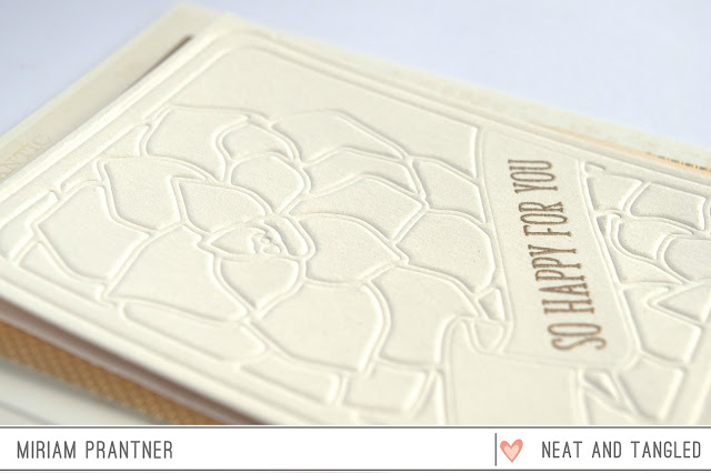
This first card was hard to photograph, but I kept it very clean and simple.  You can see the embossing better in this close up shot.  I added a few mats to complete the look.


For the second card, I used a combination of watercoloring and Copic coloring to accentuate the embossing.  I started by watercoloring the different sections and then used Copics to add depth and texture.


Here's a close up.  I love the different looks you can achieve using this die, and you don't even need to actually die cut it!  The sentiments for both cards came from the Succulent Journaling Card stamp set.


Thanks so much for stopping by, hope your week is going off to a great start!

*Affiliate Links Below

Sunday, July 24, 2016

PTI Stamp-A-Faire Part 1


I had a bunch of time to create this weekend, and it also happened to be PTI's Stamp-A-Faire weekend, so I thought I'd see how many challenges I could get done.  I'm happy to report that out of the 9 challenges, I was able to complete 8!  And the last one I just didn't feel like doing because it was too hard, and this weekend wasn't about hard for me, it was about fun.

First up PTI wanted to see our favorite PTI creation.  This is the one I picked from a recent Blog Hop.  I had a great time combining embroidery and coloring to create it, and it also uses my all time favorite PTI sentiment set (which you'll be seeing more of).


The first challenge was a color recipe.  Here is the one I picked.  


Now I have to admit that I kind of totally cheated on this one.  I happened upon this patterned paper that basically did all my work for me.  


I die cut the Leafy Branch Die from black cardstock as well as from the patterned paper, and then adhered it slightly off set.  The sentiment is from the Happy Trails set.


This next card is my favorite of all the cards I created this weekend.  It was a pointillism challenge.


I thought this image from the Botanical Blocks stamp set was perfect for the challenge, because it was small.  Ha!  Actually I thought it worked well in terms of the lines and that texture in it to begin with.  Not gonna lie, this takes a while.  But I think it's really worth it.  


The image was stamped with Antique Linen Distress Ink.  Then I went in with the darkest colors to try and define the lines.  Once that was done I went darkest to lightest and kind of 'shaded' the colors.

OK, I have a bunch of other cards to share from Stamp-A-Faire, but I thought I would stop here for tonight.  I'll share the rest later in the week.

Friday, July 22, 2016

Together Would be Better and new Winner!


So I've been suffering from a bit of creative jet lag and crafter's block.

I did a ton of crafting before vacation because of the N&T and Stamp of Approval release, and then nothing on vacation, and the just a bit of scrapbooking when I got back.

Honestly I have a whole pile of fun things to use, but I get oddly stuck when I have new stuff.  It's like I'm afraid to use it, don't know where to start, etc.

To give myself a jumpstart, I thought I would challenge myself to create something without stamps or dies.  Just embellishments.  Now you are going to look at this and say that I cheated, well I kind of did.  Often when I'm creating I end up cutting multiple sentiments because I'm trying different ones to see which works best, or trying to decide what color to use.  The extra sentiments end up in a little pile for use later, so in this case, they're more like already existing embellishments.

Most of the items on this card are old as dirt.  The base paper is a 4x6 tag from a Pink Paislee ephemera pack that I trimmed down and added some gray splatter to.  The butterfly, striped tag at the top, and the paper polaroid are also from that ephemera pack.  I did add some stitching for texture and interest.

The chipboard polaroid is Crate, and I found some old Echo Park brads that I think were part of a kit way back as well as that sparkly little embellishment which was floating around at the bottom of one of my bins.  Finally, I added a few sequins for some extra sparkle.


I thought the card could use a little more balance at the bottom and that the sentiment couls use some amplification, so I did finish it with part of a sentiment from my Origami Map set, but here the stamping was an after thought.

It was fun to just spread some things out and play.

I think I'm ready to get down to business with some new stuff tomorrow!

OK, I also need to announce a new winner for one of my release week giveaways.  Christine Canfield was the winner of the Parquet stencil, but she had already purchased it and rather than take the refund thought someone else should get it.  So sweet!  So the new winner is....D.Ann.C!  Thanks Christine and congratulations D.Ann.C!  Shoot me an email with your address and I'll get this sent right out.

*Affiliate Links Below

Tuesday, July 19, 2016

Ready for Summer


I'm still working my way through my photo backlog.  Until we got back from vacation, I hadn't printed photos in over a year because there are so many sitting around waiting to be scrapped (so I gotta keep moving with these so that I can get to the vacation photos with a clean conscience).  

Anyway, whereas Ellie just finished third grade, these photos are from her first grade end of year party.

I pulled out an old Studio Calico kit, aside from the white cardstock, all the papers are from that kit.


My all time favorite Thickers of which I only have this difficult to use green version happily worked perfectly with the colors in the layout.  And if you're keeping track, I'm now out of Rs and Ss, but still have a few vowels, so they live to grace another layout!

Thanks for stopping by, have a great day!

Monday, July 18, 2016

Watery Woodgrain


Hey Everyone!

I wanted to share an extra sample card that I made for my Craftsy class today.

The class is all about stretching your supplies and taking a second look at your products to find different patterns and shapes.

The stamp that is featured here is a Hero Arts woodgrain background.  I love this stamp because it's so versatile.  It's not a really fine woodgrain, so you can use it for water.  Here I clear embossed the stamp on three different colors of blue cardstock.  Then I fussy cut the layers to create the ebbs and flows in the water.


It's finished off with an Essentials By Ellen die cut sentiment.

It's Monday, and I have to go back to work today, so if you're dreading work today too, here's a little treat for you:  $15 off my Craftsy class!  Just use this link:  www.craftsy.com/ext/MiriamPrantner_10298_H

Hope your Monday is off to a great start!

*Affiliate Links Below

Wednesday, July 13, 2016

Back from vacation, and giveaway winners!


Hey everyone!

We had a great vacation to Nova Scotia and Prince Edward Island.  I'll share some more photos from our vacation later, but here's a group shot (at Burnt Coat Head in Nova Scotia...we're actually standing on the ocean floor at low tide).  My mom was able to come along with us, she's always wanted to go to PEI, and it's pretty amazing that she was able to go and keep up with all our trekking despite undergoing major back surgery last year!

I'm actually off for the rest of the week from work, so a little time relax here at home before I head back into the thick of things, but I did want to drop in and announce some winners from last week's Neat & Tangled Release.

Congratulations go to:

Lisa's Creative Niche, your comment from Day 1 wins you the Succulent Journaling Card stamp set.

Christine Canfield, your comment from Day 2 wins you the Parquet Stencil.

cghundley, your comment from Day 2 wins you the Pentagon Stencil.

KT Fit Kitty, your comment from Day 3 wins you the Geometric Blooms Stencil.

Winners, please shoot me an email with your address and I'll get these sent out.

Thanks so much for all your comments and support, I really do appreciate you all!

Monday, July 11, 2016

Stamp of Approval Lovely Notes Blog Hop


Hey everyone!  Today I'm participating in the Stamp of Approval Lovely Notes Blog Hop today.  I'm extra excited about this because I designed one of the products in the box, the Concentric Circle Die.

Stamp of Approval is a collection of products (stamps and dies) that work fabulously together but they’ll also work incredibly well with supplies you already own. They are released quarterly and sell out quickly (the last one sold out in 33 hours!). To be the first to know when they go for sale, make sure you are on the wait list (www.cpstampofapproval.com). You’ll get the link to purchase one day before it goes for sale publicly. Not only do you get a box FULL of amazing stamps and dies, but you’ll get a downloadable PDF Project Guide (for free!) with tons of project tutorials using them! The stamps and dies in the Stamp of Approval Collections are brand new on the market and won’t be released for individual sale for several months.

For my first two cards I'm featuring the Concentric Circle Die.

I started by cutting the die once from regular white cardstock and once from Smooth White cardstock.  Then I used Copics to color the pieces, varying the intensity of the shades in the concentric circles and added just a small bit of shading.

Those colored pieces were then inlaid into the regular white cardstock piece which was adhered to a black mat cut using the frame for the Concentric Circle Die.  The sentiment is from the Handpainted Thanks set.


I created my own polka dot paper for the mat using one of the stamps from the Lovely Flowers stamp set.

For the next card, I wanted to show that you can use the die vertically as well, and I went very modern and graphic with the design.


The die was cut from both black and white cardstock, and I cut the coordinating mat in white.  I adhered the black die to the white mat, and then added some inlaid pieces to create an alternating look to the circles.  I continued the design into the center of the die, using some of the negative cuts.  A couple of the white pieces were trimmed down a bit, and the circles on the inside are not perfect, but I think that actually adds to the graphic look of the card.


I combined two sentiments from Butterfly Notes set, embossing them in white towards the bottom of the card.  The entire panel was then popped up over some colored cardstock.

Finally, I really wanted to use the wreath from Wonderful Wreath.  The technique I used yielded two cards from one inking, and is a great way to mass produce cards.


To create the look, I colored over the wreath with a Distress Marker, spritzed the wreath with water, and then stamped it on some watercolor paper.  Without reinking or remisting, I stamped it again on a second piece of watercolor paper.  This was repeated with several shades of Distress Ink.


Then I went in with a waterbrush to soften and blend a little.  This step is totally optional.  You might like a more delicate crisp look in which case, just skip the waterbrush.  The cards are very similar, but one is clearly lighter and more delicate than the other.


I finished both cards with that Handpainted Thanks sentiment again, embossed in copper on the darker card and gold on the lighter, and then stitched the watercolor panels to the card base.  Very simple, but that wreath really does stand on its own.


OK, you'll want to continue on the hop now, head on over to Lisa's blog!  This is actually a three day hop, and Catherine is giving away a box to a lucky commenter on each day of the hop!  Head over to Catherine's blog to start.  Here is the full hop list if you get turned around:

*Affiliate Links Below